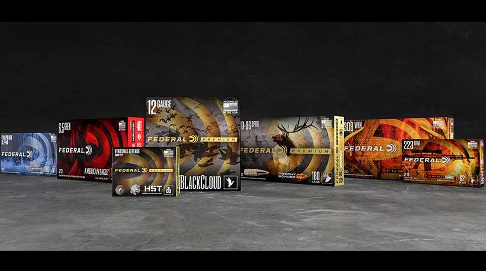
Federal Premium—the world’s largest sporting ammunition manufacturer—has introduced all new packaging and marketing materials for 2019. The company terms the change a major shift and labeled the new logo and fresh approach “The New Look of Authority” in a press release announcing the change this week.
The simplified logo with a stronger and bolder font communicates motion. Despite the new visual approach on the boxes, enthusiasts will still find the cutting-edge performance they’ve come to expect from Federal inside. “The font inspires strength, heritage and forward motion, both in the technology of our products and the attitude of our employees,” Federal Ammunition President Jason Vanderbrink said. “We’re always looking ahead, driving to be the best.”
All Federal products will now feature the new look on their packaging. The design is tailored to make it easier for consumers and sales associates to quickly identify the company’s products on the shelves. Although the Premium line is being reinvigorated with a variety of new products this year, it will return to that iconic gold color that sets it apart.
“With so many ammunition options at retail, we made sure this packaging stands out and immediately communicates what we know consumers want to see,” Vanderbrink said.
The overall look is based on the original Federal logo, yet it brings a contemporary feel with the iconic Shockwave logo. The new and cohesive look will be carried throughout the entire product line, including enthusiast favorites such as Federal Power-Shok, Top Gun, Speed-Shok, Fusion and American Eagle, as well as more recent additions such as Syntech, Train + Protect and Non-Typical.
“It started almost a century ago with our founder, Charles Horn, and we’re proud to carry on that legacy today,” Vanderbrink said. “The New Look of Authority is here.”